Organizational styles — In process!
October 26, 2012
I’ve been aware of much work on personal communication styles — how we each can best receive support, advice, criticism, support, validation, etc. And, of course, there are various personality models that help us understand all these things.
But I’m aware of much less work characterizing organizations. Thus I set about to put together this simple model. I present it here as something in process, for discussion and validation only. Please add your commentary. And if you’rereading this through another blog or medium (such as a LinkedIn group discussion), please make sure that you post here any comments that you post there as well .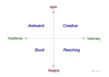
I characterize organizations along two dimensions:
Traditional . . . Visionary
Weighty . . . Agile
And the, for each quadrant, I’ve assigned a name:
A traditional organization, that has some agility but not vision, is Awkward.
A traditional organization, that is more weighty than agile, ia probably Stuck.
A visionary organization, that remains weighty, is truly Reaching.
And, finally, an organization that is both visionary and truly agile is truly Creative.
Although I suggest that this characterization is for organizations, it may better fit organizational segments, perhaps a department or work group.
How helpful is this model? Are the quadrant names appropriate and helpful? And how useful is this picture to you? Please comment.
Assessing web site usability
October 4, 2012
There are lots of tests to ensure that web sites have readable type, clearly delineated links, reasonable numbers of elements per page, etc. Web sites can be assessed according to various standards of accessibility, such as for people with motor or visual handicaps. All the information gathered from such tests can be useful – but doesn’t by itself answer the important question, “Does the web site work?”
A web site works when users feel comfortable navigating it, find themselves engaged in the experience, are able to find the information or understanding that they want. It works when users are spared those moments of fear during which they are not sure how to proceed, and are afraid that they will lose their place in some way. It works when the users’ experience is enjoyable, and doesn’t end when the most immediate goal is reached.
But – perhaps most important – a web site “works” when the user is engaged in the virtual conversation that the site owner has tried to create. This might be “Let us help you find the software you need to get your printer working”, or “. . . find the car you need, and can afford”, or “. . . sign up for the education program that will help you meet your life goals.” Of course, a specific client’s goal may be quite different than these examples.
What connects all of these conversations is that they have to do with more than just information – although information is important. They are about a user experience, that promotes engagement, that cements a relationship with the vendor or provider, that instills confidence, and, often, that results in continued sales. A colleague of mine once said, “If you want to use social media, you need to be social”, and I find this dictum a very helpful guiding principle for all web development and evaluation.
Imagine a web page for the car manufacturer, that offers three choices:
• Daisy models
• Tulip models
• Amaryllis models
While these names may be perfectly clear to those very familiar with this carmaker’s line, their presence would probably be intimidating to many users. “How do I know where to begin?”, they would ask themselves, and would then feel that they are just making a guess on one of these three.
Now consider an improvement on this:
• Our basic line – the Daisy series
• Adding features and elegance – our Tulip series
• The car you’ve dreamed of owning – the fine Amaryllis series
This removes the ambiguity for users not familiar with the car models. In that sense it’s probably “correct”. But what kind of relationship does it establish with the user? What’s the conversation? It’s simply, “We have these cars. You can learn about them here.” That’s not the conversation that will create eager buyers, or will sell many cars.
So, lets imagine a stronger approach, designed to really engage the user:
• Configure your Daisy model – a basic car, for any budget.
• Configure your Tulip – offering you more comfort, style, and class.
• Configure your Amaryllis – and be so proud of the car you’ll be driving.
Here we have a strong invitation to the website user to really try out one of these cars, start looking at colors, options, etc. The language here may not be exactly right, but I expect most of us would still find this third option the most likely one to win friends and initiate sales. It invites a relationship that must, of course, be continued in the rest of the web site interaction.
In the examples above we can see at least three aspects of web site usability:
• Users can proceed with clarity and confidence (not made to feel foolish).
• Users learn relevant information about product or service.
• User are drawn in to a conversation, engaging with the vendor.
How can we assess these in a systematic way? As a skilled practitioner, I can certainly review a web site, and offer much constructive feedback. Indeed, much of my role is in offering such expert critique or suggestion.
But such one-person theoretical review has strong limitations. The real test is how the web site works when actually used by typical users. (I may resemble the “typical” printer user or car buyer, but I’m certainly not the typical prospect for a vocational college.) My method is simple to understand, but logistically can be quite complex.
- Clearly identify the persona to be used in testing. (This should have happened during web site design, but often it does not.)
- Define a test script, which the subjects will be asked to perform. (This may be finding some information, assessing several institutions, learning a skill, etc.)
- Determine a performance test, that will be used after the test to see what the subject has learned, their inclination to proceed with the content, their inclination to consider a purchase if there is a sales objective.
- Find the test subjects, using the criteria identified in (1) above. Typically subject will be paid for their time.
- Conduct the test, simply watching each subject, but with no intervention. Sometimes we will video the test as well.
- Conduct the test again, but asking the subjects to annotate their behavior – at each step, say what they are doing, why, and what kind of response they are seeking.
Note that we are never correcting or guiding the subjects – with one exception: If they appear to be lost, we may inquire what they are seeking. We will not answer their question, but will record in detail the dilemma the user reported.
On occasion, we’re called upon to review not just a web site in isolation, but its performance relative to the sites of competing vendors. This might involve simply repeating the test on several sites, or we may devise particular performance tests that measure how subjects rate the various vendors based on the web site experiences.
What I’ve described here may seem quite different from the more analytical evaluation processes often used by other usability consultants. I prefer this holistic approach, in which web sites are evaluated primarily by their performance rather than by an enumeration of characteristics.
Only after going through the testing process might I want to review the statistical data offered by such tools as Google Analytics. These tools are particularly helpful for identifying how users arrive at the site and where on the web site they tend to go. But the tools offer little guidance about the user experience, motivation, relative ease or frustration, etc.
In summary, I recommend, and I practice a holistic evaluation of web sites, in which behavioral goals are clearly identified, and in which silent observers watch users during real interactions with the web site, or in which the observers interact with the users only to identify more completely the user’s experience. Web sites work when they create and engage users in a productive conversation.
Postscript: Usability review is not design review. I’m a very visual person, and appreciate fine typography, uncluttered layout, elegant design. I’d like to believe that these are an important part of web site success. But data suggests that they may not be as important as I would like. In any case, the tests that I’m describing here evaluate how users behave when working with the site, and not how the site appears to its designers or critics.


